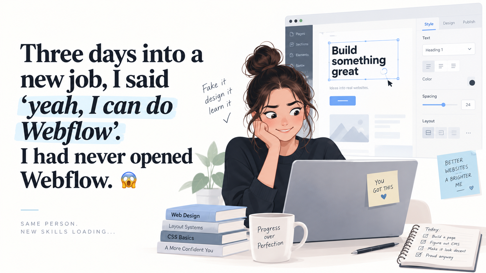
Three days into a new job, I said 'yeah, I can do Webflow'. I had never opened Webflow.😱
Three days into a new job, I confidently said I could handle Webflow without ever having opened it. What followed was one day of unexpectedly fast progress, frustrating bugs, and a navbar that nearly broke me.
I was three days in. Still in that phase where you’re waiting for real work to land on you. I got bored.
So when Webflow came up, I said “yeah, I can do Webflow give me the task” - confidently, out loud, without checking the stack, without opening the tool, running purely on the assumption that I’d figure it out because I usually do.
Then I spent the day discovering why that was both a great and a terrible idea.
I shipped a website that day. A genuinely good one. I also spent hours losing a fight to a css class name and a hamburger menu. Both of those are the honest review.
Why it was a great idea
The bluff held because Webflow isn’t hiding the web from you. It’s a visual layer sitting directly on top of HTML and CSS. Flexbox is Flexbox. Grid is Grid. A div is a div.
So I wasn’t learning a website builder. I was learning where knowledge I already had lives inside someone else’s panel. Set display: flex in the Style panel and the children line up in a row — exactly what the code would do (Webflow University).
That’s the whole trick, and it’s why one day was enough:
Classes, not elements. The moment I stopped styling individual elements and started styling reusable classes, the build accelerated with every screen. Change the class, change everything. This is the one mental shift that separates flying in Webflow from fighting it.
Breakpoints as a workflow. Design at desktop, then walk down the device sizes. An hour to get comfortable, and responsive stopped being a task I dreaded.
The output is clean. This is the part even Webflow’s critics concede — real design control, semantic markup (Studio Blanco).
By mid-afternoon I genuinely thought I’d gotten away with it.
Why it was a terrible idea
The navigation.
The stock Navbar component looks like a gift. Hamburger menu included, breakpoints handled, dropdowns supported. Then you customize it and discover it carries opinions you cannot see.
My hamburger wouldn’t open on mobile. Not because I’d built it wrong,the menu was expanding perfectly. An overflow: hidden on the navbar at that breakpoint was quietly clipping it out of existence. That exact fix appears in the Webflow forum over and over ( Webflow Forum ).
Fixed it. Then the dropdown opened behind another section, because the navbar ships with a z-index of 100 and something else on my page was sitting at 1000 (
Webflow Forum
).
Fixed that. Then the mobile dropdown opened on top of the other menu items instead of pushing them down — which has its own pile of threads, because the default behavior is almost never the behavior you want ( Webflow Forum ).
Here’s what made it hectic rather than hard: in code, every one of those is a one-line fix I’d have spotted immediately. In a visual builder, there’s no error message. There’s just a broken menu and no visible cause. You aren’t debugging your work — you’re debugging defaults someone else set, which you can’t see until you already know to go looking for them.
The advice I eventually found, and now fully endorse: the stock navbar behaves unpredictably once you touch it, so plenty of experienced Webflow users skip it entirely and build nav from a plain div ( r/webflow ).
I would have liked to know that before the bluff, not after.
What I’d tell the version of me who said “yeah, I can do Webflow”
The learning curve isn’t really a curve. It’s flat and pleasant for a long stretch, then spikes violently at a few specific places — navigation, overflow and position interactions, and anything with hidden component defaults. Reviewers keep reaching the same verdict: exceptional design control, punishing onboarding ( Emergent ).
-
Learn classes before anything else. Everything downstream depends on it.
-
Don’t fight the stock navbar. Build your own from a div once, reuse it forever.
-
When something looks broken, check overflow, z-index, and which breakpoint you’re actually editing. That’s most mystery bugs.
-
Webflow University isn’t extra content. It’s the manual.
-
If you know CSS, a two-week learning curve becomes a one-day one. Developers avoiding Webflow because it’s “no-code” are the exact people it’s fastest for.
Webflow didn’t remove the hard parts of building for the web. It moved them. Layout and responsiveness got dramatically easier. Debugging got harder, because the thing breaking your page is a setting you can’t see.
Would I confidently claim I can do Webflow again, without checking? Absolutely. It worked.
I’d just build my own navbar first.